An Elevator to the Fire — Are You Experienced?
I was recently at the Loew’s hotel in Rosemont, IL, for a work event and was ready to head home.
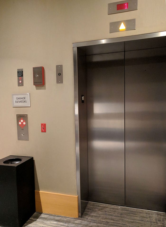
A peer asked if I parked in the hotel garage, which I had, and pointed to an elevator bank. I quickly scanned around the elevator doors for the buttons to call the elevators.
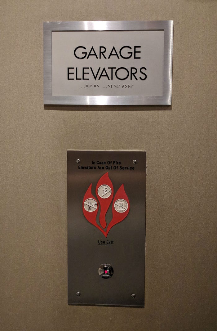
I saw this…

The sign confirms I’m at the elevators that take me to the garage. But, where is the button to call the elevator?

oh.
In case of fire? If I press the button, does it mean I am not pressing the button, taking the stairs, not riding the elevator, using the exit, calling emergency services, starting a fire — what, what, what?
My confusion resulted from the visual distance between the “Garage Elevators” sign and the button to call them and, in-between, the “you’re going to burn if you ignore this” image, which is closer to that button.
The cognitive dissonance I experienced can be explained by the design principle, the “Principle of Proximity,” which says that “elements that are closer together are perceived to be more related than elements that are farther apart.”
By surrounding two vastly different customer goals — I want to go to my car in the parking garage and I want to avoid dying in a fire — within a single metal background, which also boxes them together and separates them from everything else, the two become connected in our mind.
There are a number of ways to improve this experience.
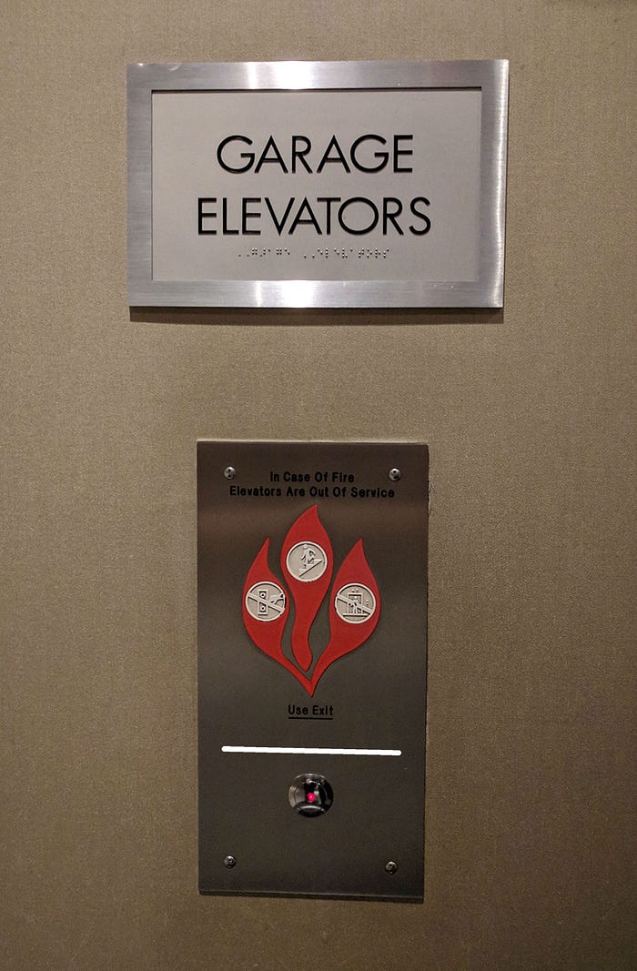
The easiest, cost-effective improvement would be to put a line between the fire message and the button. That doesn’t improve the proximity of the sign to the button, but visually separates the warning from the button.
The “Use Exit” has a line under it, but the words are black and have very little contrast with the background, making them difficult to read. But, low contrast is an entirely other usability problem. Today, we’re talking about proximity.
Back to the problem at hand.

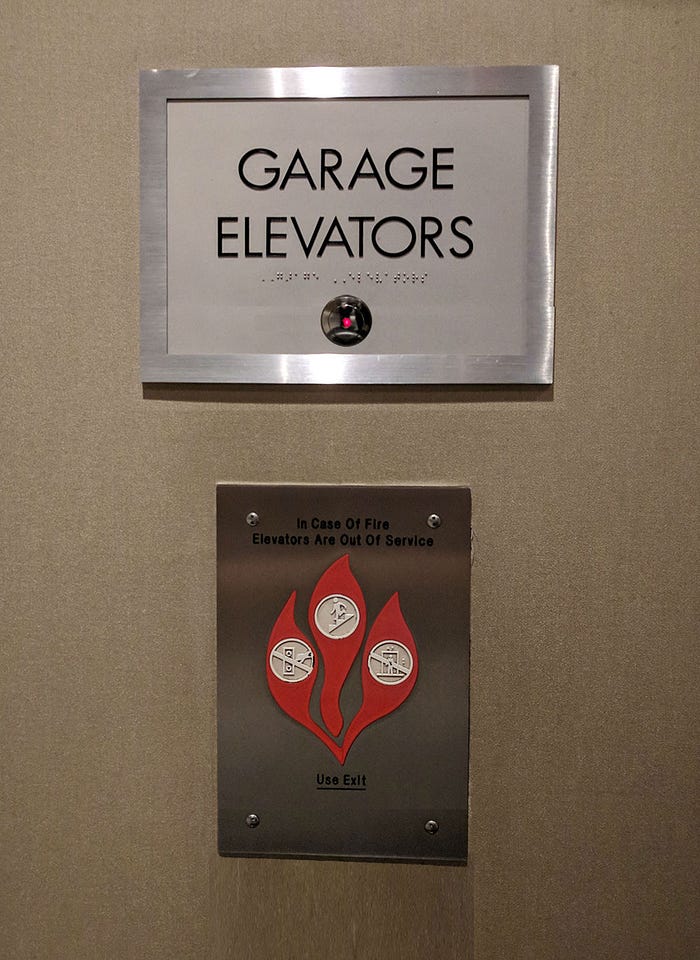
While a white rule provides some value, the best experience would be to move the button next to the elevator sign and separate the elevator button and fire messages with enough space to show they’re separate, but related concepts.

Additionally, moving the button near the braille letters improves the accessibility of the elevators, saving those who are blind or have poor vision from having to hunt around the wall for the button after reading the braille.
Until someone chooses to improve the user experience, let’s hope no hotel guest thinks the elevator button will call the fire department instead of the elevator. And, if that happens, let’s hope the fire department chose to take the elevator instead of the stairs and came ready to put out that fire.
The “Are You Experience?” posts are observations of my world and thoughts on ways to improve the experience for everyone. All opinions are mine, unless they aren’t.
